Showpad Navigation Analytics
Introduction
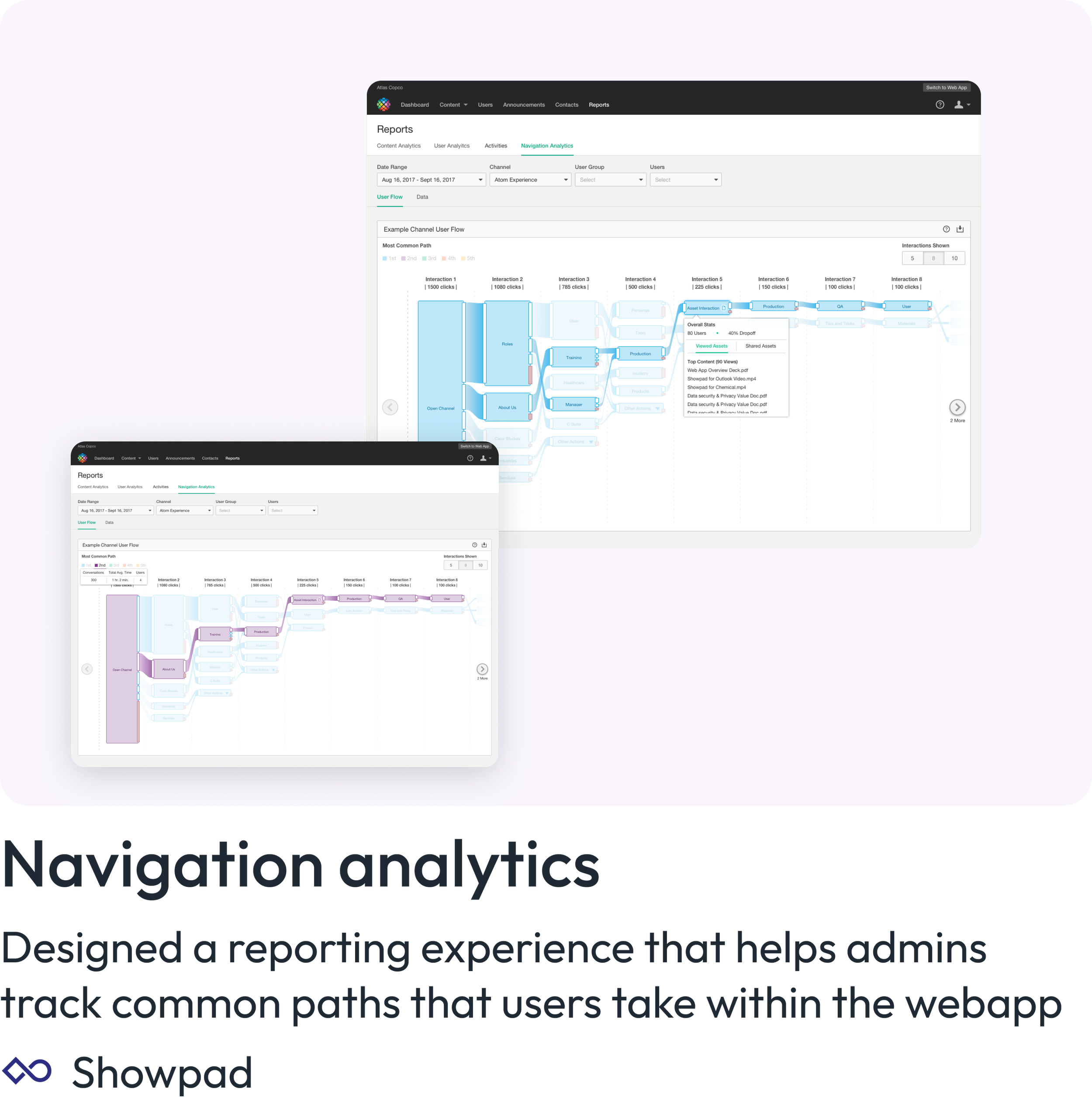
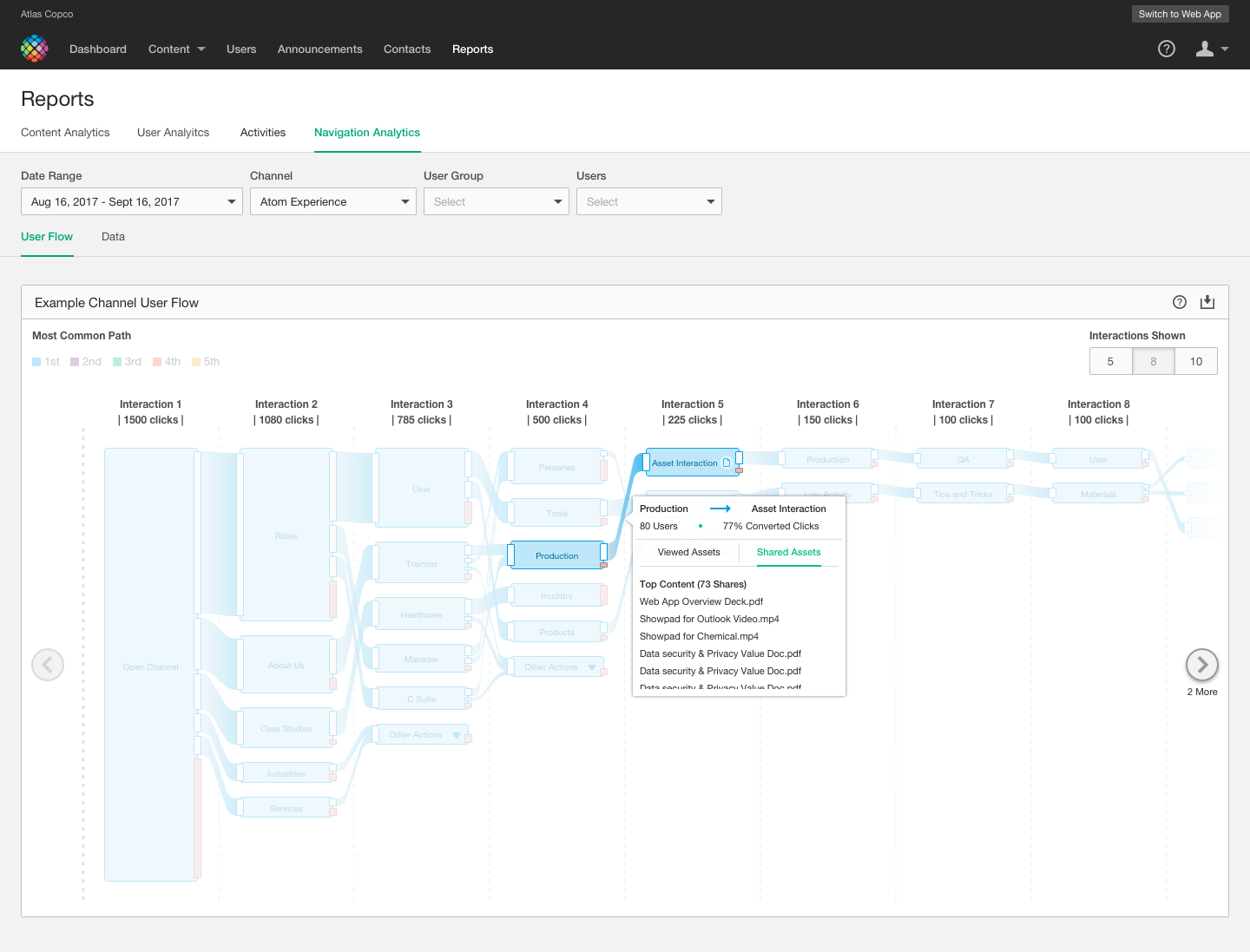
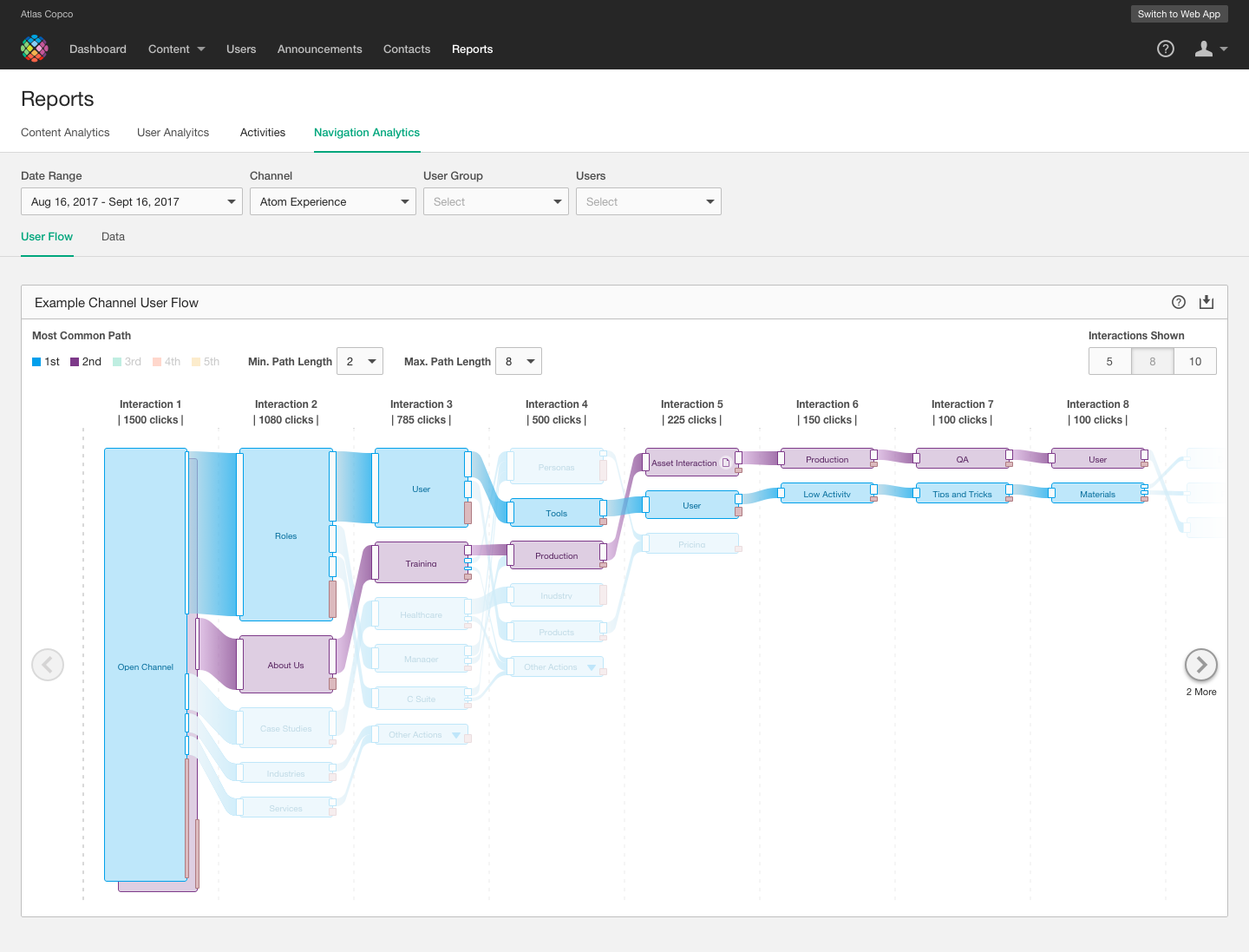
Navigation Analytics allows admins to track paths that users take through a particular channel, experience or folder structure. The size of each node represents the number of interactions or clicks that a user takes while navigating through this experience. An advanced mode makes it fast and easy to see 5 of the most common routes a user takes, either resulting in a dropoff (exit of the experience) or the act of sharing or viewing a piece of content.
My Role
Product Designer
The Challenge
How do we create an experience that allows admins to track all possible flows that users can take in Showpad?
Status
Shipped 2018
Components
User Flow
Data Tables
The Product
User Flow
A visual representation of users navigation experiences while using Showpad. All flows from users are combined to give the admin a bird’s eye view of the users they manager.
Raw Data
An alternative table view that gives admins full flexibility in the way they interact and utilize data. Filters offer flexibility in the table result and admins can directly export all contents.
Data Driven Design
Interviews
The first step my team took when beginning this project was conducting interviews with existing customers. Focusing on admins, we set up a number of interviews with many different types of customers. The goal was to fully understand the needs of admins and how we can create a product that helps them to manage and learn about the ways that their users find and interact with content in Showpad.
Competitive Analysis
To understand how other companies create similar experiences, we looked at successful examples of users flows and some examples that didn’t quite work as well. We wanted to understand the different features and options that were provided to users and what features would make sense for our customers. My team and I explored a few different options.
Google User Flow
Google displays clicks and conversions from one page to another using nodes and connections. The visual display and size makes a lot of sense to someone trying to understand where most clicks occur.
Sunburst Charts
Sunburst charts allow for navigation from the inside out, but does not display information as easily in a cyclical pattern. While easy to read and understand, this type of chart was not successful in displaying our data.
Design Iterations
Throughout the design process, I performed multiple usability tests to develop the designs further. Each screen was redesigned multiple times until the team felt like we landed in the right place. My team and I tested the designs from low fidelity sketches to hi fidelity prototypes.


